Making a Webpage out of an XML file
01 Aug 2018 | 8 minutes to readXML is traditionally used to store and transport data in a way that is readable to both computers and people. At my job as an engineering intern at Open Dental, we save our database schema as an XML file for each minor version we produce. Between versions there will be new columns, new tables and other differences. We post each version of the schema online as a plain XML file. This post describes how I used an XSL file to implement an webpage with some simple QOL additions.
The result of this post can be found at: https://opendental.com/OpenDentalDocumentation18-2.xml
The method used to display the webpage is unusual to say the least. Each version of documentation is stored as an XML file on the server. When a web request is made, the XML file is served in addition to an XSL file, which controls how the XML file is displayed. This is usually used to embed XML data in a webpage. The XSL is a style sheet much like CSS, where is describes how an XML file should be displayed.
A good summary of XSL functionality is here
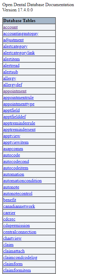
Before I made the changes, it was much more difficult to find the information you needed from the page. When the page was loaded, you were presented with a list of all the tables that extended far off the screen. If you were trying to find a specific table, you would spend your first few seconds wildly spinning the scroll wheel as fast as it could go.
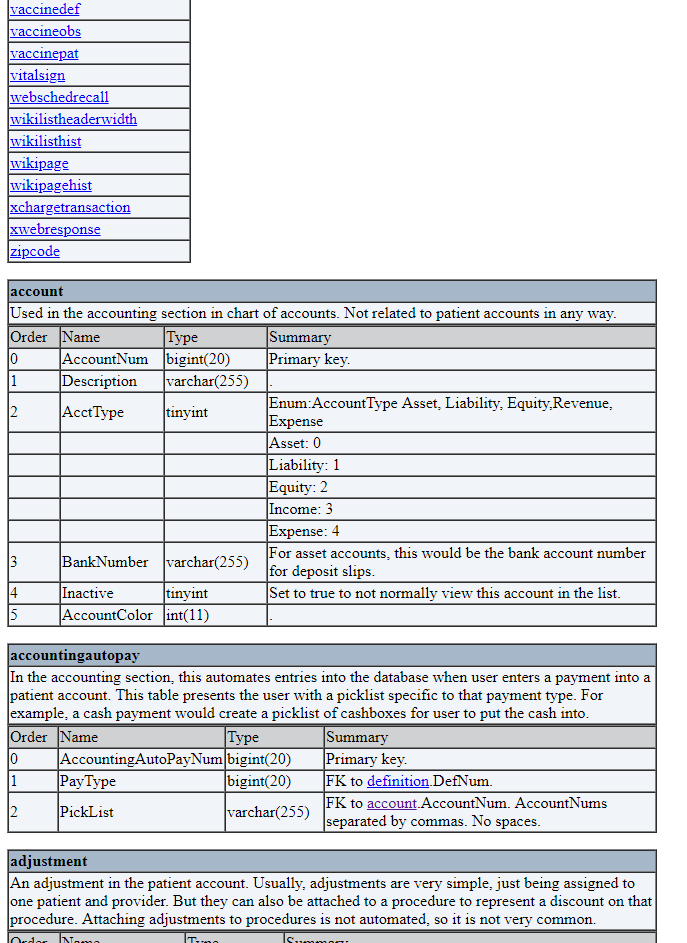
Below the enormous list of tables was the descriptions of the tables themselves. Each database table was constructed as a table, titled with the name of the table and the general description underneath. Below that each column was listed, and the order, name, type and summary were listed. If you wanted to find a specific table, you either had to find the table name in the list of tables, or scroll until you found it. Looking up a table for reference took a long time and really gave the scroll wheel a workout.
Once you found the table you were looking for if you wanted to compare it to a previous version, you had to navigate back, select the version, then scroll to the table in question. To me this workflow was absolutely infuriating, so I set out to fix it.
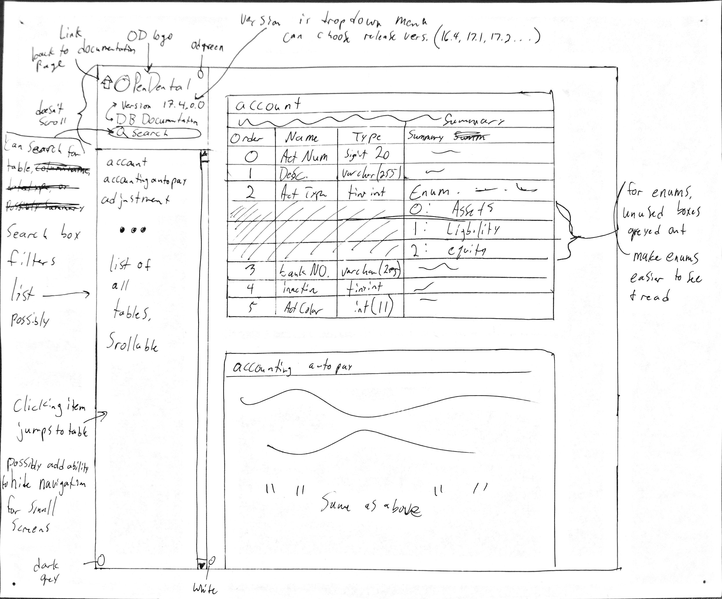
When I was designing the page I wanted to obviously make it much easier to use. I decided to split the page into a navigation pane and a table pane, with the list of table names on the left and the tables themselves on the right. I also wanted them to scroll independently so searching for a table name wouldn’t screw with what was displayed in the tables pane.

Additionally, I wanted to add a filter function to the navigation pane to make finding a specific table quicker. Instead of needing to find the table you wanted in a block of text, I wanted the list of tables to change as the filter term was typed in. So if a user filtered on the string “code”, only tables containing the term as a substring would be shown. In our case, it would show table names like “proccodenote”,”codesystem” and “zipcode”.
A version selector was another function that I felt would be useful enabling a user to compare tables between versions much faster and easier. Much of the time our techs will switch back and forth between versions to pick out new columns and their function. Usually to do this one would have to go back a page, then select the correct version from the list. Having a dropdown menu with all of the documentation versions listed makes it much easier to swap versions.
Finally, I wanted to add anchors to each of the tables. This makes it possible to link to a specific table on the page, making it easier to share the table documentation with other engineers or customers. Having the anchors would also make it less difficult to compare tables between versions because the page would immediately navigate to the table in question.
The XSL stylesheet tells the web browser how to display the XML documentation file. To make the website I used a combination of html and javascript. Writing the html portion was relatively straightforward. Each HTML tag is an element, and behaves much the same way regular HTML does. XSL adds additional tags to use, allowing us to pull elements and attributes from the XML document in addition to looping and branching. The XSL presented an interesting challenge because of how each page would need to be stateless. When users navigate to the documentation, they navigate to the XML files. It meant that I needed to design the XSL in such a way to be able to communicate across pages without depending on a server backend. When the page is requested the user is simply served the XML and XSL files, nothing else. This made it fun and interesting for me to figure out how to make the different functions work.
The navigation pane is filled (from the top) with a company image, the version drop down, the table filter, and the list of tables for that version. The values in the dropdown menu are hardcoded, which sadly means a new entry needs to be added to list of options for each version release. The option selected depends on the the XML being viewed, reading directly from the pathname in the URL. It relies on the javascript portion to do the calculations. Javascript is also used to perform the filtering. The list of table names is defined in the XSL by looping through each table element in the XML file and recording the title. Since the names of the table are distinct, I also use the table names as an anchor. It also provides a human-readable method of referring to the tables. It makes it easy to tell from a glance which table is being linked just by looking at the URL.
Beside the navigation pane is the tables pane. It was relatively straight forward to construct in the XSL file. I only needed to loop through each of the tables and pull the fields to display. Each table is displayed using an HTML table, so it is very simply to make the header and just loop through the column elements. Of course this introduces lots of nested looping, but we only touch each element once when constructing the tables luckily.
The javascript is what I am most proud of for this project. Usually CSL are only meant to contain basic HTML formatting, but I was able to encapsulate the javascript in a CDATA tag. This prevented javascript from being parsed as XML, which would of course throw errors. From there is was easy to use some basic javascript to liven up the page and accomplish the design goals I set for myself. When the documentation page is first loaded, it will parse the URL to determine which version is being shown, what anchor is currently set and the search term if there was one. That way when popping between versions the only thing that would change would be the data. When a new version was chosen a function would package the current page settings and build the destination URL out of them. The chosen filter string and anchor would then persist between pages which I think is real slick.
Filtering was accomplished by refreshing the list of table names on each key up in the filter box. To filter, we would loop through each table name and make a case-insensitive check to see if the filter string was present. When we wanted to omit a table we simply set it’s display style to none. Because the page is extremely lightweight, the filtering also feels crisp.
In the end, I was very happy with the finished product (my boss was too haha). It is now much easier and quicker to reference tables and schemas from the documentation. In the future we may upgrade again to a more traditional and fully featured web page, but I am happy with what I was able to accomplish using just an XSL file. If there is a need or want for it, it would be nice to add a few more features to the page, such as viewing multiple versions at once and auto-sensing the versions to display in the drop down. I think both of these functions would probably need something driving the pages behind because of what it takes to access a version. It would take some more work figuring out how to make synchronous requests from the XSL, but it sounds like a fun challenge. Maybe someday!


